Website Rework: The Olive Tree Soapworks
Brief provided by: General Assembly Australia
Duration: Jan 2023 - Feb 2023
Toolkit: Figma, Figjam, Zoom
UX/ UI • User Research • Web Design • Prototyping • Information Architecture
A solo project that I undertook as part of General Assembly’s Flex-immersive course in UX design. It involved redesigning an existing e-commerce website with a focus on optimising its information architecture and visual design based on insights synthesised from conducting our own research.
PROBLEM SPACE
What is the problem area and what are the challenges?
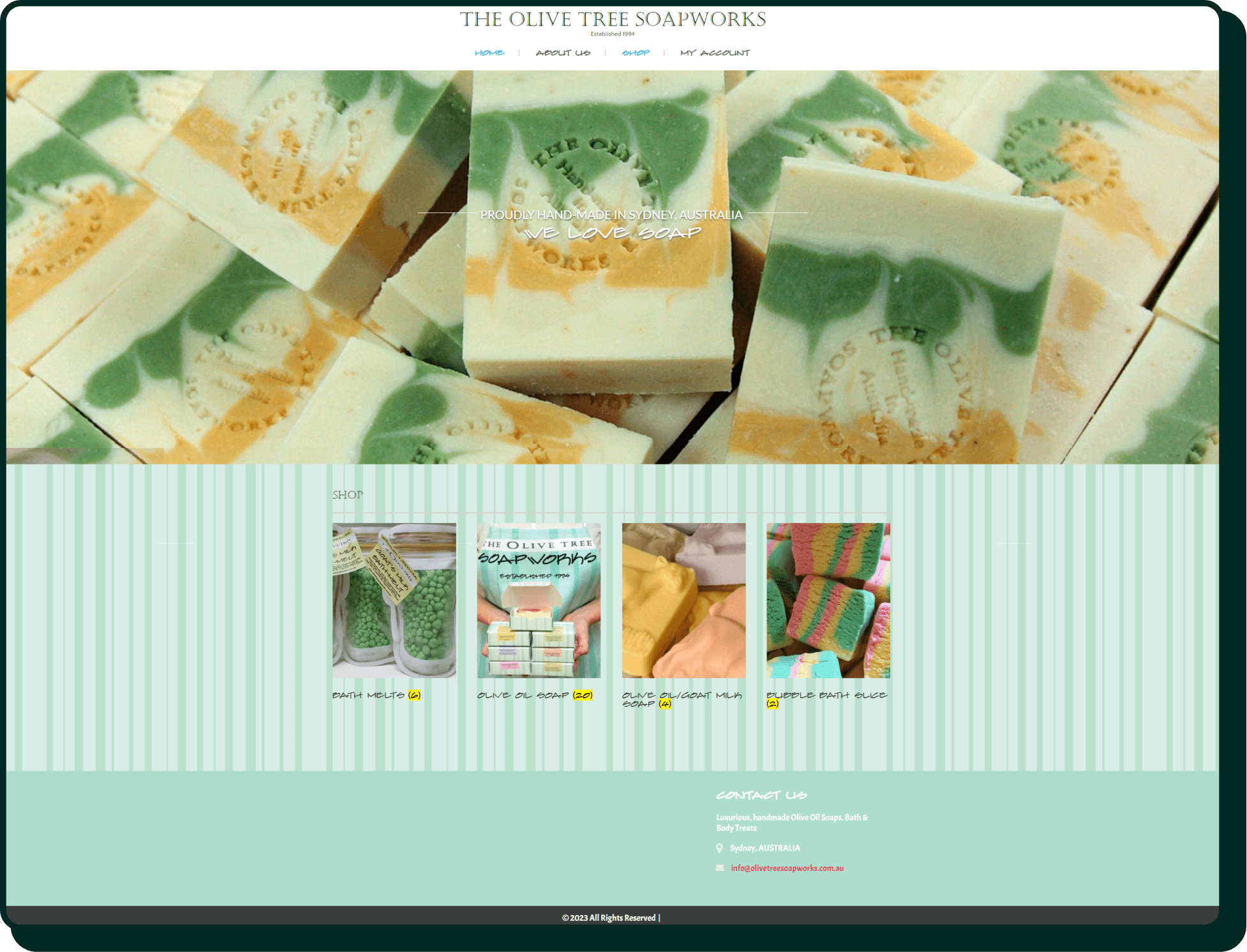
The Olive Tree Soapworks is a small business that has been operating since 1994. They used to trade out of The Rocks Market here in Sydney before they seemingly decided to operate solely through their online website. They sell handmade artisanal soap and body treats with olive oil as a key ingredient. The company values quality products, sustainability and community.
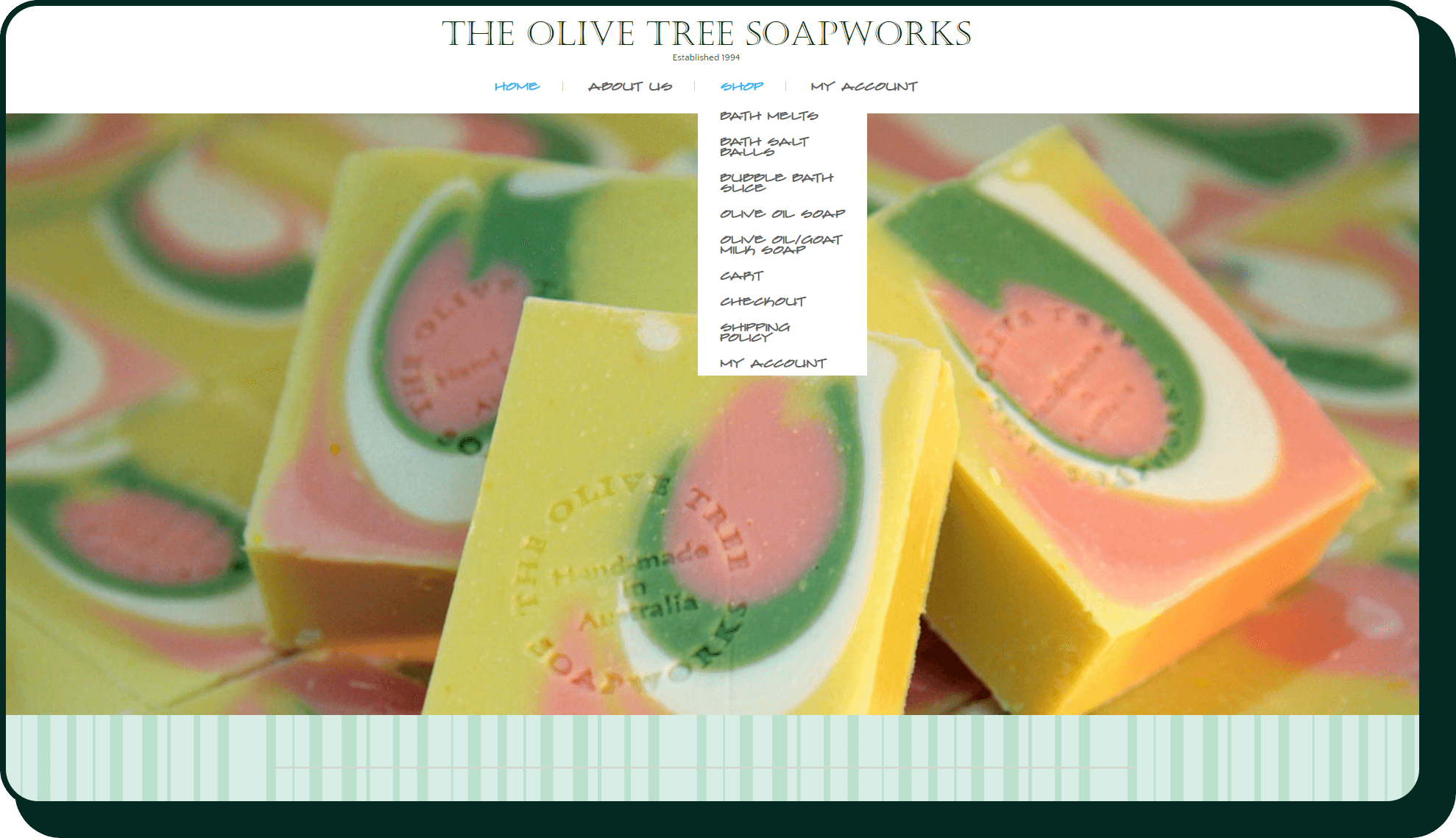
My initial thoughts when navigating the website was that it’s not very user-friendly. The overall design is outdated and there are issues with its navigational structure and hierarchy. The clash of visual elements also results in complications with font readability and legibility.
RESEARCH & INSIGHTS
Feature Inventory — User flow Comparison — Element Analysis — Pluses & Deltas — User Interviews — Persona Ideation — Problem Statement Ideation

MARKET RESEARCH
Are there any e-commerce trends in the industry? Are key user flows of competitors as streamlined as they could be?
A few key insights did arise when I compared the key user flows of direct competitors and other e-commerce websites:
multitude of ways to discover products
items tended to be categorised by product type, application on the body, or in featured collections
it’s possible to make the checkout process more concise
multiple options to contact customer support
The businesses all offer the bare bones of an e-commerce website in the sense that you’re able to make an online transaction by the end of it. Noticeable differences:
larger companies offer chatbots
size of company doesn’t necessarily restrict what features you can have (minus chatbots, it seems)
USER INTERVIEWS
What key insights were identified to inform the next stage of the design?
I conducted the interviews with three users over zoom and there were a few prevalent themes and key insights:
users would like different options available when contacting customer support
users prefer to not have to sign up and register an account in order to make a purchase
featured products are helpful for first time visitors to the website
reviews are helpful for first time visitors
PERSONA & PROBLEM STATEMENT
How do I compile this data in order to better understand the user’s needs, behaviours and frustrations?
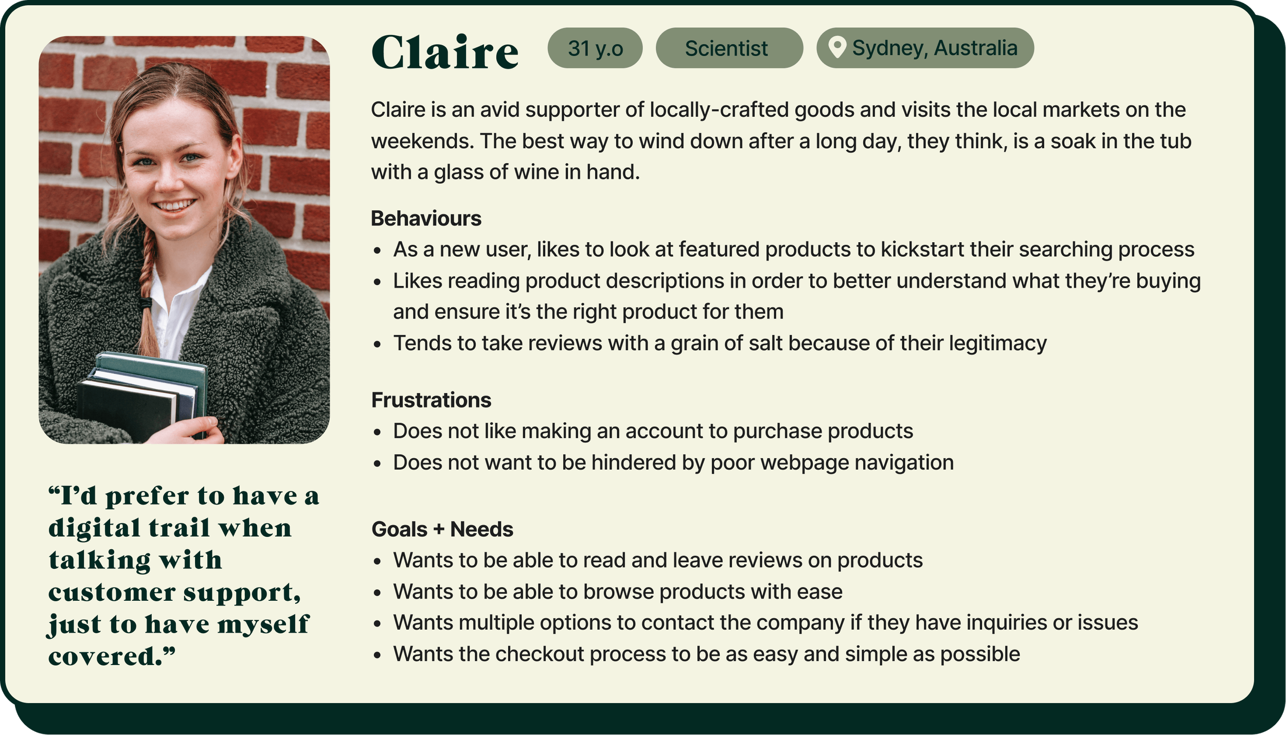
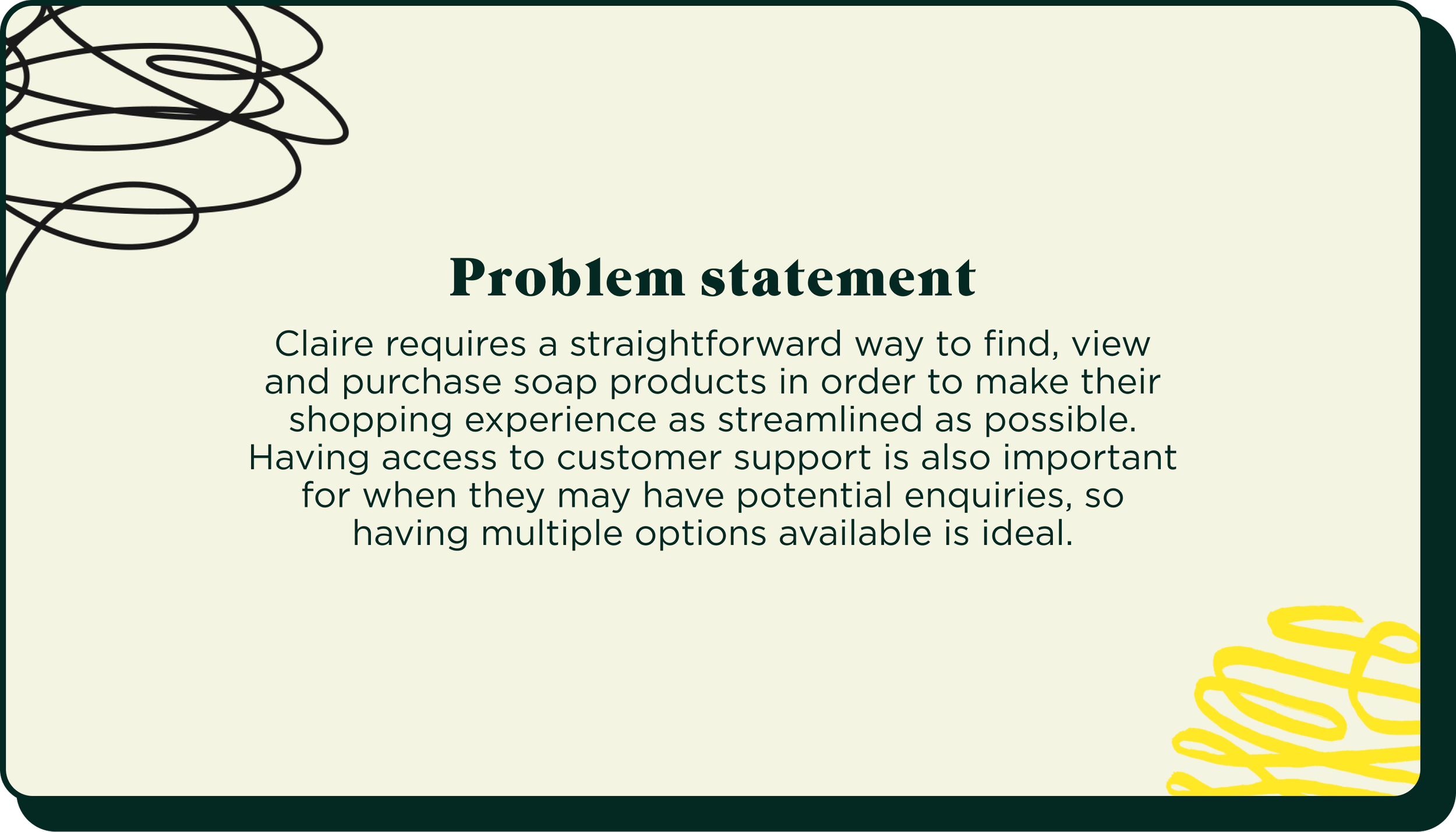
Claire is a persona created from the data collected directly from the user interviews—her behaviours, frustrations and goals represent what a real user could experience when navigating through the e-commerce space.
From there, compiling Claire’s needs into a paragraph was a helpful way to succinctly identify what problems need to be addressed.
KEY USER FLOWS
What are the finalised key user flows of the website?
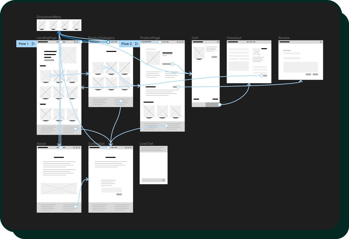
By comparing the user flows of competitors, I used it as guidance to determine the best path for users, prioritising the route that would allow for optimal efficiency. For example, the checkout process is reduced to two screens to make it more streamlined for users.
IDEATION & PROTOTYPE

SKETCHES & WIREFRAMES
What is the website going to look like?
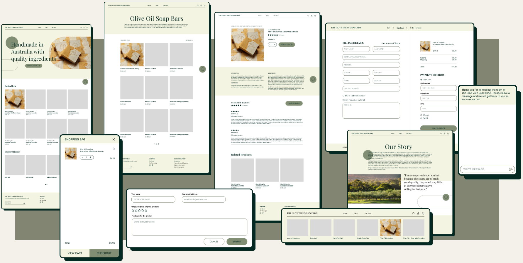
This allowed me to start to visualise how I wanted the screens to look whilst maintaining the idea that each sketch is to offer users what should be the most favourable experience.
REFINING THE VISION
Bringing it all together.
Functionality-wise, the navigational structure and implemented features were all informed by the insights brought forth by the research.
Stylistically, I redesigned the product to freshen it up:
incorporated a new colour palette and fun shapes to modernise the website with the intention that it will now better represent the handmade artisanal products that the business produces
the colour palette I chose was inspired by the namesake of the business itself, representing the leaves, unripen fruit and oil of the olive tree
the cool, earthy tones evoke a sense of relaxation and calm
USABILITY TESTING
What went right? What went wrong?
Overall, the testing went really well and all three participants were able to successfully complete the tasks within the internal metrics. There were some observations I made as the participants went about the tasks and when prompted, they also provided invaluable feedback to improve the experience:
all three users tried to click on the product image to navigate to the next page
two users manually scrolled to the review section whilst on the product page
one user pointed out that the breadcrumb navigation on the checkout page was lost on them initially
one user suggested having a feedback screen after the checkout process so that users can get validation that the action has been recognised and acted upon
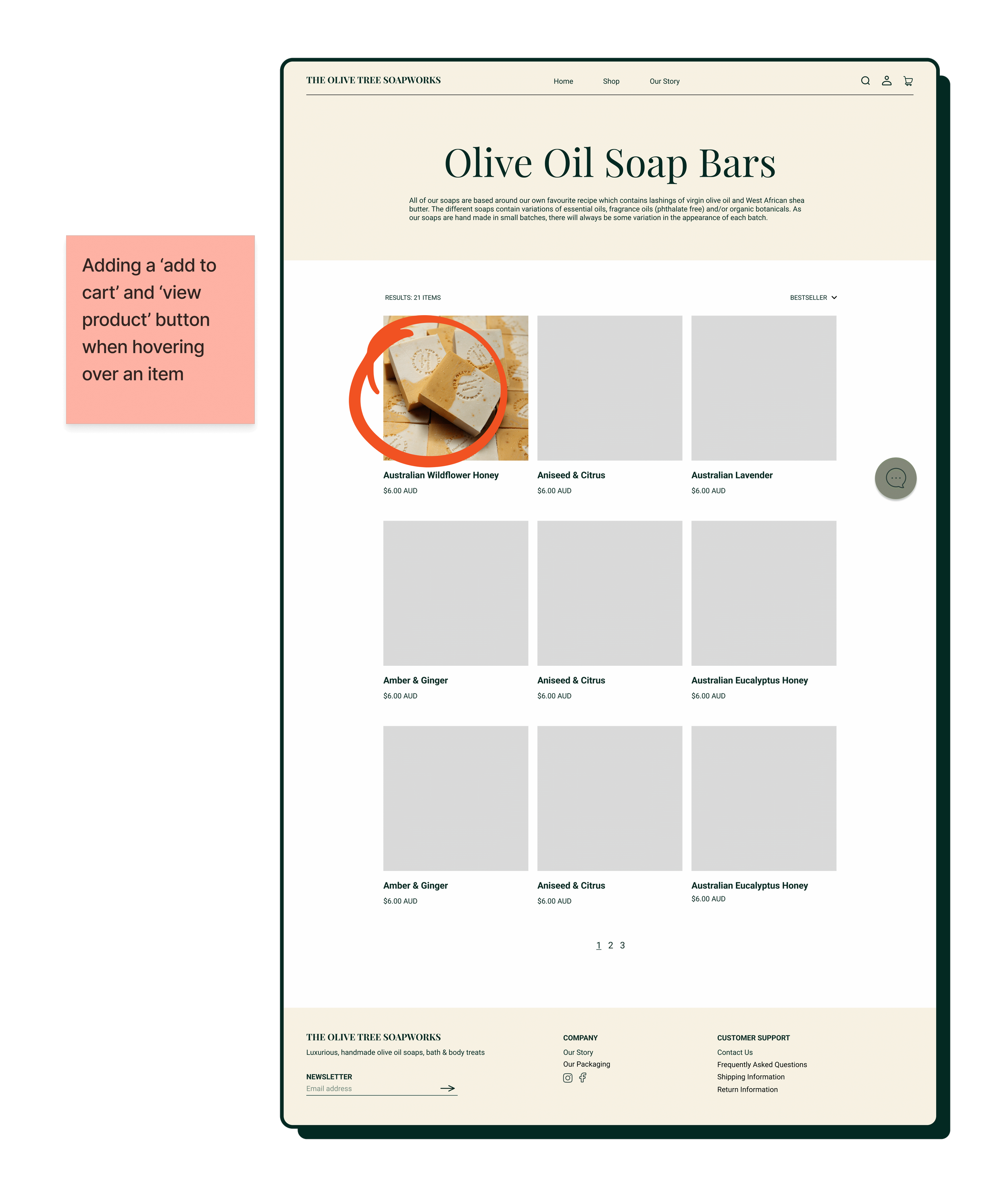
one user suggested having a way to add a product to cart directly from the multiple listings of products as it would be more efficient


ITERATIONS
What changes can be applied?
Iterations came in the form of some minor navigational design tweaks which tackled 80% of the feedback from the usability testing. These adjustments included:
adding buttons when hovering a product in the explore pages to give users the option to click through to the next screen or to add the item to the cart immediately
adding an underline to the number of reviews to let users know it’s a clickable feature
repositioning the breadcrumb navigation in the checkout screen for optimal visibility
WRAP UP
WHAT’S NEXT?
What can be improved on overall in the entire process?
Having feedback screens for the checkout process, review feature, and the internal email form
Prioritising tasks and time management